Art collective NAM have created gravity defying photographs for Harbour City Chocolate Trail, a charity project for the Hong Kong Blood Cancer Foundation. The series uses a method of suspending objects and people with strings and cables to create weightless environments that appear to be caught mid-explosion. All taken within one photograph the effects is mind blowing, It is nice to see work that is done in studio for once rather then later on in photoshop, like many adverts you see today. Here is a video below showing how they created these photographs and the techniques behind them.
For more gravity defying photography! look at my previous post about photographer Thomas Jackson.
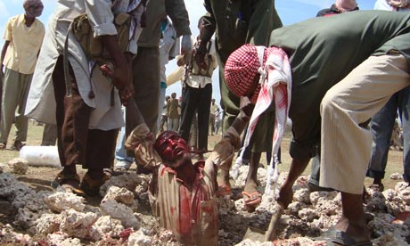
After some thinking these are what i think of such images being taken: I believe images like this should be show to the world. As I feel that many of us are born, especially in first world counties, with wool over our eyes. We all live very comfortably and many of us not knowing much of the world outside our country and how lucky we really are. Taking pictures of tragic events is a way of showing the true world that we are living in. These photographers are a witness of those events and they should be shared in order for human beings to reflect more deeply onto the world, plus themselves and I think help shake the world out of their indifference. Photography brings forward issues and educate people who do not wish to listen to words. However when looking at these images it is shocking,it almost makes you not want to look or know about why this man has had this done to him because of guilt you were not there to stop it. Yet I feel it is disrespectful towards the stoned man to offer no captions or text explaining why this has happened to him.
"I have been a witness,and these pictures are my testimony. The events I have recorded should not be forgotten and must not be repeated." – quote from James Nachtwey a documentary photographer of war and suffering
If people are more interested about war photography, how its done, why some feel the need to do it and what kind of person it takes. You should look at the documentary War Photographer. It can be found on YouTube and its really insightful. Focusing on James Nachtwey and the stress of dealing with viewing the worst of the world as a job.
Instagram is an application for smartphones that has recently just been bought by Facebook for
$1billion. For anyone who doesn't know the application, it allows the user to
take a picture with their phone then add coloured filters and borders to it, to create a 'vintage' effect. You can then upload your photographs taken with the app on to the social network facebook, where friends can see and share with each other. The debate about Instagram is very heated. Many people turn their noses up at it, saying that it is not a true form of photography and laugh at those who class themselves as photographers that use it. While others simple see it as a fast and easy way to share and capture moments with each other, having fun with the many filters that make the pictures more appealing.
I am personally annoyed with seeing pictures taken on Instagram filling my facebook newfeed of mundane objects and scenes, blue skies, light poles, bus stations, coffee cups, office chairs and even paving stones, suddenly are classed as cool and amazing with a old rusty filter place one top of the image. Often the effect doesn't match the subject, a brand new pair fluffy slippers in bad lighting with a dusty scratched old 50s tint effect placed on top? really?
Yet I'm not saying that I think Instagram is a bad thing, as I have seen some very good photographs with good compersions and lighting. However I feel that many people look down upon Instagram simple because normally the bad photographs out weigh the good. Yet it quick and easy giving many people who don't have time or unable to understand film photography a chance to still show their artistic flare, which might have become lost without this app. But it often annoys people who send long amounts of time developing film and working really hard to get an effect, while suddenly instagram can do it in seconds.
Overall I think Instagram is good, if used by people who already understand image composition and lighting. Its very simpler to how digital photography and photoshop are looked down upon, but are slowly being accepted as a art form.
I went to the Saatchi Gallery to see the group exhibition Out Of Focus: Photography. Designed to give students, both British and international, a chance of exposure and a opportunity to display their work in an established gallery. The Saatchi Gallery is known for displaying innovative and contemporary art and this exhibition was not a let down. However the exhibition lacked structure and flow, yet it matched perfectly to my own personally way of liking to view book. Allowing you to wander the gallery rooms and become excited to what you might find in them.
One of the most captivating of artist works were the beautiful landscapes of the American west by young photographer David Benjamin Sherry that can be found in gallery space two. His photographs are dramatic mountainscapes with otherworldly light.The dreamy and surreal colours were cast at exposure or later during printing, and the kind of colour cast that he created depended completely on his mood at that time.
Mat Collishaw's work can be found toward the back of the Saatchi in gallery space 10. His large 'photographes' are made from hundreds of tiny ceramic tile, places together to make the illusion of a large scale pixelated photograph. The tiles make a high gloss finish, as well as the placement of tiny mirrors mixed within the lightest patches to add to the effect. My favourite piece of out of the three being showcased was Madonna. The face of Madonna is a cropped photographed of an Indian women taken after her village was destroyed by a flood, a timeless and tragic face. Mat Collishaw uses mosaic to immortalise his subjects the same way images of saints where in early churches, while the pixelated effect refers to the Internet culture of today.
The work Hannah Starkey's women in everyday scene can be found in gallery space 12. I found it strange to come across her work within the exhibition, especially as i was lead to believe the work was for upcoming artist. Not already established photographers, yet it was still a pleasant surprise. She explores the everyday experiences and observations of inner city life from a female perspective. She see herself as a street photographer, however her style of shooting is not the average candid approach of many street photographs. First finding an location then waiting till finding a person who she finds interesting to appear. She asks for permission from the sitter and tell them what she wants, creating structured and controlled photographs.
On the lower ground floor space of gallery 15 can be found the work of Richard Wilson, the only permanent installation at the saatchi gallery and has been on display since 1991. Viewed from above from a platform the viewer is shown a infinite pool of black, making the illusion of a highly polished floor. The installation fills the space to transformed gallery 15 into a expansive and epic visual space that mirrors the saatchi's architecture. The pool is made from used sump oil which has flooded the room, a thick and pitch black liquid. A beautiful and absording piece, but be perpared for the slight smell of engine oil up your nose!
I went back to ShowStudioto see their new exhibition called Selling Sex.To read about their previous exhibition scroll down and read my post ShowStudio - In Your Face. ShowStudio is an amazing place and i would advise everyone to check it out and its free to enter! They always display interesting and unusual work, that in most galleries would not. The exhibition contains a mixture of pieces such as photography, film, painting, fashion, collage and even sex toys.
Selling Sex battles against how many images of women created by the media that are done by men, often using the female body to get out to wider audience. The prospective in this exhibition is changed by featuring all female artists, therefore examining an 'self-other' relationship and examining their unique relationships to sex and the female nude. The exhibition allows women a chance to get there work displayed without the ''male gaze''. only 8% of the work exhibited at the Museum of Modern Art is created by women and at the the Tate’s female holdings amount to a only 15%. The imbalance doesn't only exist in fine art. But also in fashion, nearly all famous designers are male and major shots are done by top male photographers. Film women hold only 33% of all speaking roles and only 7% of all directors in Hollywood are women. And there remain only three industries in which women earn more money than men - pornography, prostitution and modelling.
ShowStudios aim is an exhibition made up of exclusively women artists looking at sex and nudity - examining a woman's version of a woman and asking how it differs from a man’s? Is an image of a nude woman empowered in the hand of a female artist? Does it resist traditionally constructed gender roles? Does it mock a voyeuristic male gaze?
The work I felt most draw towards was Porn sewn on Valentino Advertby Inge Jacobsen. Photography graduate Inge Jacobsen is a London based artist who takes found images and makes them her own through embroidering, cutting, and colleaguing.The images she uses are from women’s high fashion magazines and pornographic images found on the Internet. The reason I felt so draw towards this work is I have a personal passion for embroidery and collage, especially on photographic images.
At the Sprüth Magers Gallery in London I recently saw the work of artist Thomas Demand. Thomas Demand is often known for making photographs of three-dimensional models that look like real images of rooms and other spaces. However for the exhibition the work that was displayed was different from his normal style. It is a collection of photographs that were studies everyday and mundane objects. Things you would often pass thinking nothing of it or in some case looking at it only as rubbish. Yet Thomas Demand almost forces the viewer to notice these day-to-day object that often go unnoticed and realise the beautiful in them.
In The Dailies, Demand for the first time experimented using an out of date process of printing called dye transfer, which involves fixing dyes with gelatin to ordinary paper. Very similar to technicolour, fixing each primary colour to the print paper one at a time. Demand chose to use this print process because its over saturated colour, however not garish effect. I found the style of print beautiful, it created an image depth not normally seen now a days, as well as an almost pop-art feel. While talking to one of the gallery staff, she informed me that this style of print process has actually stopped in production, meaning that no more of the gelatin fixing dyes are being made anymore. Meaning that is possible that Thomas Demand could have used up the last of the remaining supplies and these are the last photographs to ever be made in this process. Which I find weirdly upsetting as it make such rich and bold prints.
Upstair in the Arnolfini Gallery is the first major solo exhibition of the artist Shilpa Gupta. Gupta creates
artwork using interactive video, websites, objects, photographs, sound and
public performances to probe and examine subversively such themes as desire,
religion, notions of security on the street and on the imagined
border. When you first enter into the show, you are presented a wall of shelves holding book covers made of metal. The piece is based around 100 books that have been written by either anonymously or under a pseudonym. The books are a mixture from around the world, different centuries and other cultures.the authors of the books hide there real names for many different reason, ranging from fear of imprisonment to simply thinking a different name would seel the book better. The work looks in to social, political dialogue of discrimination and understanding
individuality.
The second room contains a piece called Singing Cloud. A large cloud shape made out of 4000 microphones. The microphones have been changed so instead of recording sounds, they emit a soundtrack made out of fragments of speech, that ripple and 'sing' across the works surface. Also in the room is a flap-board, used traditionally to announce arrivals and departures. The board displays short sentences that change every few seconds. The flap-board symbolises the numbers of the people migrating and those lost in this movement.
Within the third room is two other pieces of work, one a series of photographs and the other a wall with tape stuck directly to it creating a flag with text. The photographs show her in military style clothing doing many different poses, creating gun shapes or covering her eyes and mouth with her hands. These images reflect the violence in the world and the repression of knowledge. The tape flag created out of yellow tape symbolises nationhood, however along the tape is printed "there are no borders here". The piece brings forward the ideas of both physical and psychological division between people simply because of where they live.
The text on the flag says: I TRIED VERY HARD TO CUT THE SKY IN HALF, ONE FOR MY LOVER AND ONE FOR ME. BUT
THE SKY KEPT MOVING AND CLOUDS FROM HIS TERRITORY CAME INTO MINE. I TRIED
PUSHING IT AWAY, WITH MY BOTH HANDS, HARDER AND HARDER BUT THE SKY KEPT MOVING
AND CLOUDS FROM MY TERRITORY WENT INTO HIS. I BROUGHT A SOFA AND PLACED IN THE
MIDDLE, BUT THE CLOUDS KEPT FLOATING OVER IT. I BUILT A WALL IN THE MIDDLE, BUT
THE SKY STARTED TO FLOW THROUGH IT. I DUG A TRENCH, AND THEN IT RAINED AND THE
SKY MADE CLOUDS OVER THE TRENCH
Photographer Thomas Jacksonhas created a series of images based on the idea of swarms, shooting large hovering masses of objects in locations around New York. He says the idea is still a work in progress and that some of these photos should just be considered “sketches.” However i find his work to be stunning, creating interesting movement in his photographs, similar to schools of fish. His images contain objects that you would unexpected in their surrounds, such has leaves floating through a city street. To see these images larger and other work for him, click on his site here.
I have always found double exposure photography to be beautiful and very effective, however the works of Florian Imgrund and Dan Mountford really show the outstanding effect that double exposure can create. Two different artists I found through flickr, yet very similar, as they both merge portrait and landscape photography into single photos using double exposure.
German photographer Florian Imgrund got his first film camera in the summer of 2010 and has made incredibly good use of it since. All of his double exposure work is done completely in camera without the use of photoshop. Working mostly in black and white, he creates a dark and eerie feel in his photographs.
British photography and graphic design student Dan Mountford studies at Brighton University, England. The photos shown above are from his series called "The World Inside Us". Dan describes this series as “a visual journey through our minds by calm and tidy means which the reality of everyday life does not show.” He explores the use of double exposure in his photographs, successfully isolating parts of an image in camera with no help from Photoshop.
I recently found the work of korean artist Seung Mo Park. He creates giant portraits by cutting layer after layer of wire mesh. Each work begins with a photograph which is superimposed over layers of wire with a projector, then Mo Park slowly snips away areas of mesh. Each piece is several inches thick as each wire mesh that forms the final image is spaced a few finger widths apart. I have seen simliar techniques done to make work like this, ofter an image printed on to sevreal layers of glass, however Mo Park's idea of using wire mesh out outstands me.
I found a youtube video which shows him creating his masterpieces:
I went to the Arnolfini Gallery in Bristol to see the work of Sophy Rickett. The piece I saw was 'To The River' a new video/sound installation, filmed during the spring equinox on the banks of the River Severn. The film focuses on a group of people a waiting for the Severn Bore to pass. The Severn Bore is a tidal surge that sweeps up the estuary of the River Severn during a certain time of the year, it is one of the largest in the world and many people come to see it. The piece investigates the relationship between humans and the natural world.
Sophy writes: ‘The project will explore issues that have resonance locally, and also globally. I am interested in ideas around politics and the environment, and also in the very demanding and teleological relationship humans have with the natural world. I am also interested in the Bore as a subject in itself, and equally in its ‘agency’ in broader philosophical and cultural terms.’
The film is projected on three different screens in the corners of a large dark room, each screen is edited to play different parts of the film at the same time. A recording is played in the room, a mixture of crowd talking and waiting for the wave to pass and the low rumbling of the River Severn in the background. The sound echos around the room, surrounding the viewer. You hear the crowd joke and banter, while trying to entertain themselves in the cold while they wait. For a long time the crowd suddenly fall silent while small waves pass, this silence seem endless in the dark and you feel the same anticipation as the crowd, until a women breaks the silence and the crowd being talking again.
I went to a exhibition at National Portrait Gallery to see the Taylor Wessing Portrait Prize candidates and winning photograph. Many different photographers enter, both young new artists and established professionals hoping for the chance of winning and getting their work shown in one of the top gallery in the country. The work is picked anonymously and judged according to its photographic values.
One photographers work I liked was Olive Selling Dresses by Kenneth O Halloran. What I liked about the images is the angle of the camera, shot at a low eye level, something unusual when viewing a child. The tones work amazingly, the cold pale blue tones of the dresses on display in the background contrast well with Olive's Freckled warm skin tone and clothing. He found Olive at a boot sale, so I'm some way this is a form of candid street photography. He asked for her permission and her parents before talking the picture, and I think he did a wonderful job in capturing her.
Another artist work that captured my attention was Oliver by Kelvin Murray. The surreal qualities of the image is what drew my eyes towards it most, a young boy in a raincoat standing in a shower with a sad face. For me the whole pictures has a very depressing and defeated feeling with in it, as well as a feeling of silence. These feelings are heightened by the use of pale pastel tones and dull shadow. Something quite quirky and unexpected about this photographs is that Oliver actually won in a raffle to be photographed.
When looking at Micheal Britt's Photograph of actress Kiera Knightly I was quite sceptical at first. As I felt it was unfair to be entered as by using a famous person it put the rest or at least most of the other candidates in the competition at a disadvantage. As many of the viewers will connect much more easily because there is already fame around the sitting and it can be related to because she has been seen before. However this picture hung on a wall at the far back of the exhibition and was still already to capture my eye from far away. It really grabs your attention because it has a good composition, interesting colour palette and soft lighting. Something else quite refreshing about this picture is that it is unphotoshopped, strange to see a celebrity like this. Yet I feel it is this that makes the picture so powerful. Making her seem more human like everybody else, still able to get wrinkles. The simplicity is also beautiful, a simple head and shoulder shot, which allows you to really appreciate her beauty.
However the winner of the Taylor Wessing Prize was a disappointment, as well as the runners up. To be honest I felt quite sad when moving around the exhibition as I was surprised that this work is meant to be the top portrait photography being made in the country. But I felt like I was walking around a room full of mostly depressing people staring down the len of the camera. There was little excitement as all the picture where pretty much the same. The winner was a portrait of a young girl with a somber face holding a ginger guinea pig that matched her hair by photographer Jooney Woodward entitled Harriet and Gentleman Jack. A ginger child with animals won last year, giving the impression that if you wish to win enter a pretty ginger child with a cute fluffy animal.
Booooooomis a blog i have been using for years since it first began and i would really advise anyone creative to check it out. The blog displays work of unknown and up coming artists in a range of different mediums. The layout is simple plus attractive and the blog is mostly image based, allowing easy viewing letting you investigate artists for yourself.
If your interested in a blog that has photography, film, music, art and design all in the same place - check it out!
I went to theJohn Hansard Gallery to see the work "Monsters of the Id" by David Cotterrell. The exhibition is a mixture of video, audio, interactive media and artificial intelligence a hybrid of modern technology. The work was specifically designed to display in the Hansard Gallery and the technology had never been used for display in a gallery before. The layout of the gallery was changed for the exhibition, even adding new rooms and walls. The exhibition captured the disorientation of a civilian observer within a
militarised environment.
As you entered the exhibition you was presented "Observer Effect" a large visually curved barren landscapes, as you stood within the space, slowly dark unnerving figure would appear and walk towards you. The amount of figures that appeared depended on the number of people in the room, however while i was their only four figures appeared during my two hour stay but the work was still only in testing at this point.
Upon entering the second room you find the work "Searchlight 2".The information taken by the sensors in the previous room is translated onto a long desert landscape of "Searchlight 2". You see yourself projected onto this work as a small fleeing figure moving across this landspace. The work symbolises the way in with aerial drones pick up movement within war zones. The piece is made out of piled white chalk which cracks and shifts similar to that of desert sands, i found this fascinating as of the sheer amount of time it must have taken to complete. The work is quite chilling as it makes you feel so watched and small within a landscape.
"Apparent Horizon"is the third piece of work shown in the exhibition, it is displayed in to small rooms parallel to each other, you stand within the doorways and before you is shown two domed landscapes. Apparent Horizon shows our role hovers between sublime reverie and the quiet anxiety between of periods
of violence. Final in a smaller back room has a set up room that shows the inside of a military field base. The piece places you in the centre of what would be the surveillance base in the war zone. The room contained authentic military equipment and allowed you to walk about it freely.
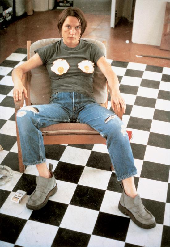
In our lecture we discussed the use of metaphor and allegory in images, personally i found it very hard to grasp as both metaphor and allegory are very similar to each other. A metaphor is a figure of speech in which a word or phrase is applied to an object or action to which it is not literally applicable. A allegory is a picture that can be interpreted to reveal hidden meaning. We looked at two pieces by Sarah Lucas, Self-portrait
with Fried Eggs (1996) and Au Natural (1994).
Self-portrait with Fried Eggs
(1996) is an image that combats the ideas of gender stereotypes by her
presenting herself as androgynous. The
main metaphor of the image is her fired egg breasts; they are all that prove
that she is in fact female. Eggs are often a symbol of life however because
they are fried this view is alters, perhaps this is an important representation
to Lucas. Her masculine pose and dress sense contrast with the expected views of
how a women should be, while the makeshift kitchen floor places her in a realm
were the old fashioned idea of a women should be placed.
Au Natural (1994) is a
representation of married life consisting of a dirty mattress, an old tin
bucket, sagging melons and a stiff cucumber with oranges. The piece removes all
glamour making marriage seem depressing and mundane, almost making it seem
almost as a life sentence. The objects symbolise sexual organs, both the breasts
(melons) and the penis (cucumber) are living fruitful objects, still able to
work. Yet the tin bucket symbolises the way in which many women see their genital
as they grow older
We talked about the uses of semiotics in images, I personally didn't know what semiotics were but i found out it is actually something i do alot of in my own work. Semiotics is the study of signs, images, sounds, gestures, objects and the language behind certain imagery and how it effects how we look at things. We learn semiotics naturally as we grow and the way we see certain signs depends on many factors such as age, culture and sex. We all can read images and signs differently, meaning that semiotics can not actually be teached because there is no true semiotic behind anything.
We looked at this image advertising pasta and other similar food. We discussed what semiotics that photo has to help sell the food. The deep red colour makes you think of passion and a strong rich flavor, while the fruit and veg makes you think of freshness. The fruit and veg lead you to believe its all natural and organic, however its packaged dried food in plastic. The found is show in a shopping bag, this make you want to go out and buy it straight away or to add it to your own basket because it has already visually been placed into your brain. The simple use of Italian writing is a semiotic adds to the idea that the food is made with passion, as Italy is know for its pasta dishes.
We also discussed the semiotics in the music video for Johnny Cash's "Hurt". A very powerful video that I feel represents Cash's life coming towards it's end and show him looking back on his life. While watching the video you notice alot of biblical references, this is most likely because of johnny Cash's god-like following within country music. Empty museums full of old Johnny Cash merchandise are shown, the museums are 'churches' were his fans would go, however showing them empty symbolises the end of his fame and ultimately his existence.
We talked about how the video had a very Renaissance feel to it, with a look of many paintings of the time. A references of 'The Last Supper' is seen, Cash sitting at large banquet of fruits and meat, known for lasting only a short while before rotting, the food symbolises how short life is. The wine he pours refers to life washing away and how wealth and luxury mean little to a dying man. The video ends with Johnny Cash closing the piano, symbolising the end.
I travelledto London with some friends and we came across a gallery called ShowStudio (1 - 9 Bruton Place, London, W1J 6LT) and by came across i mean searched for hours. I really wanted to see the exhibition that was being held called In Your Face, named because the work being shown is very bold and defiant. The exhibition show work ranging from fine art, sculpture, film, fashion and photography, yet they all shared the same idea of being 'in your face'. Coming from a BTEC Art & Design course I always find myself drawn toward all types of mediums in art not only photography, i look at the work displayed and get inspiration to add to my own practice.
I went because i heard that one of Nick Knight's photographic prints was on display but while there i found myself also very interested in the work shown elsewhere around the exhibition. All the work dealed with different ideas of portrait and I found this very interesting. I found the gallery very easy to move around in the and staff very willing to name and explain what the peices were about as none of the work came with text, perhaps to leave the veiwer to make you their own ideas of the work.
The work of Nick Knight that i went to see was 'Devon' (1997). It is a photograph of Japanese/American model/actress Devon Aoki dressed Alexander McQueen shot for the cover of the style magazine Visionaire in 1997. The photo is a combination of two visionaires in the fashion, a world famous fashion photographer and a world famous designer. The work is meant to be confrontational and thought-provoking, and captures Aoki with a dark, futuristic style. The colours are muted and cold, along with Aoki serious expression makes a powerful emotion come from the photo. As i stood in front of the image I felt as if she was also looking back at me, i feel this is very important in portrature.
Another
display of work I found interesting was 'Sauna Faces'by Stephen Doherty,
We were given an lecture to introduce us too Visual Exploration unit today. For
the unit with are required to submit an on line blog to inform our lectures and discuss our uni sessions. We were shown some examples of current photography
blogs which could help us with our own, if you haven't looked at these blogs before i would really recommend having a look.
We also had first seminar in
visual representation on the same day, it involved discussing a chapter from John
Berger’s “Ways of Seeing”. This chapter is only images and has no text, which can seem quite odd to many people used to seeing images with text. Text is often placed with images to tell the viewer about the narrative of the images, yet John Bergers has done other wise.
Why Berger has produced a chapter in a book based solely on images? Berger could have produced a chapter only of images to allow the viewer to
come to their own conclusions to what the images are about and their own beliefs about the image. By not including text there is no distraction. Text could have also
provide additional information which could have changed or altered the
audience's view of the images. Having text for the audience, they are basically told how to think.
What narratives are suggested by this sequence of images? What ties them
together? I noticed that many of the pictures portray women and we disscussed this in our session, we all agreed that the women in the pictures are shown as unequals and are even shown within pictures with slaves and animals. He seems to look at women as a low social class and never show women in a position of power, often depicting them in domistic setting as wives with children or just sexual objects. However in some pictures the women are shown as temptresses or witches using their bodies to surduce and over power men, this could mean that Bergers also looks down women seeing them as evil and unholy.
Following on from this how can the reading of these images change over
time? As time passes the images slowly become less relatable to the passing generations, as cultures change and certain issues become less important. This changes how we look at the images and the context we understand them in. Women are no longer seen as unequal to men, now both work alongside eachother and have equal rights. Also any pictures with biblical refences are seen less important to todays generation, as religion is less dominant in everyday life and belief. Much of the pictures in the chapter show issues that were around in the time that they were created, meaning these no longer relate to us and are simply a window into the past. Yet because we wasnt live at that time, we could mistake the pictures are fact, which in most seem unlikely.
It was interesting to discuss the issues of context and how people can look upon images differently, this is important to understand how your own personal work could be seen different to how you could wish.